Here’s a tutorial covering how to use each widget in the Basic Widgets category in Flutter. Each widget is demonstrated with a simple example to showcase its functionality.
Basic Main.dart File Structure
To use the examples in this tutorial place the code within the Center Widget’s child property
import 'package:flutter/material.dart';

void main() {
  runApp(const MainApp());
}

class MainApp extends StatelessWidget {
  const MainApp({super.key});

  @override
  Widget build(BuildContext context) {
    return MaterialApp(
      home: Scaffold(
        body: Center(
          child: //PLACE CODE HERE
        ),
      ),
    );
  }
}
Center
The Center widget centers its child within its parent. The
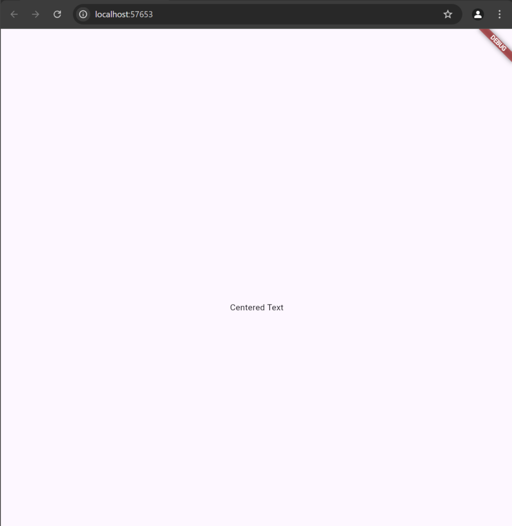
Center(
  child: Text("Centered Text"),
)
Container
The Container widget is highly flexible, allowing you to set size, padding, margin, color, and decorations.
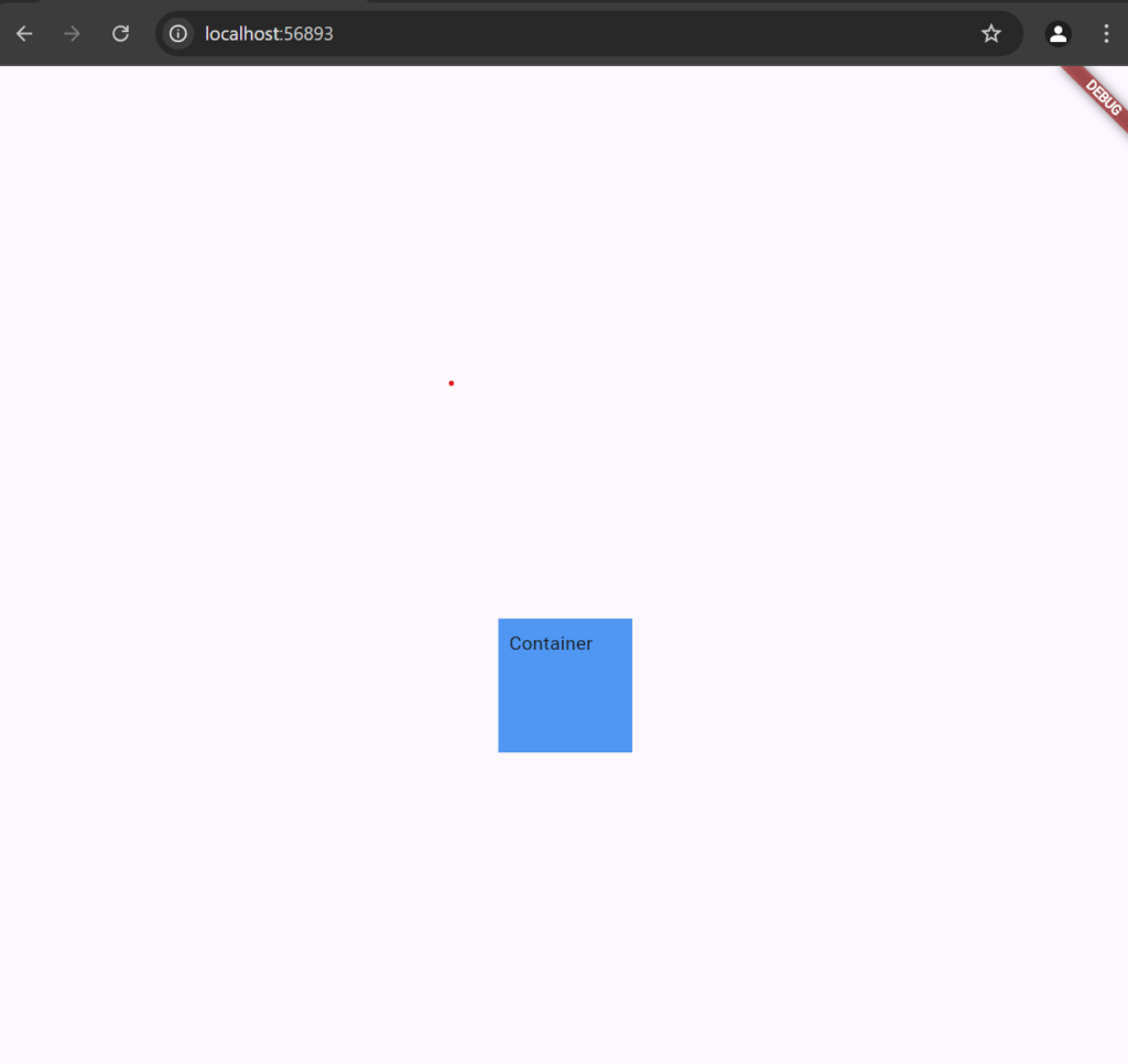
Container(
  width: 100,
  height: 100,
  color: Colors.blue,
  padding: EdgeInsets.all(8),
  margin: EdgeInsets.all(16),
  child: Text("Container"),
)
This example creates a 100×100 blue square with padding and margin. Container is often used for styling and positioning other widgets.
Text
The Text widget is used to display a string of text with optional styling.
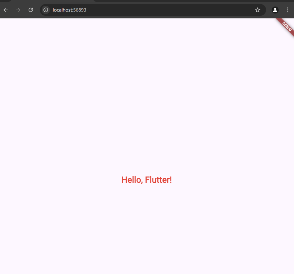
Text(
  "Hello, Flutter!",
  style: TextStyle(fontSize: 24, fontWeight: FontWeight.bold, color: Colors.red),
)
This displays “Hello, Flutter!” in bold red text with a font size of 24. You can adjust TextStyle properties to customize the appearance.
Image.network
The Image widget is used to display images from different sources
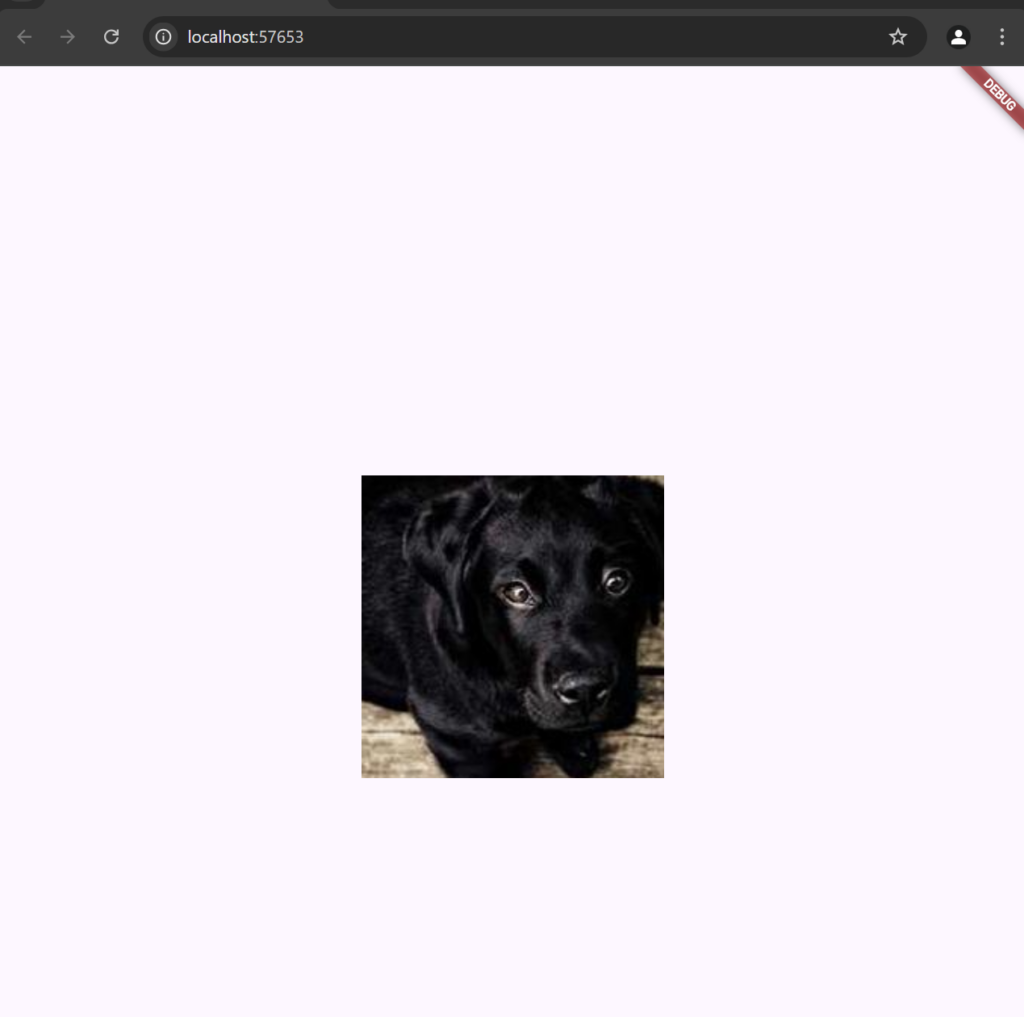
Image.network(
          'https://picsum.photos/id/237/200/300',
          width: 250,
          height: 250,
          fit: BoxFit.cover,
        )
This displays an image from a URL and scales it to fit within 150×150 pixels. You can also use Image.asset for local images.
Image.asset
- Create an
assetsFolder:- In your Flutter project directory, create a folder named
assets(or any name you prefer).
- In your Flutter project directory, create a folder named
- Add Your Image:
- Place your image file (e.g.,
my_image.png) inside theassetsfolder
- Place your image file (e.g.,
Step 1: Add the Image to Your Projec
my_project/
├── assets/
│   └── my_image.png
└── lib/
    └── main.dart
Step 2: Register the Asset in pubspec.yaml
- Open
pubspec.yamlin the root of your project. - Under the
fluttersection, find or add theassetssection. - Specify the path to your image file.
- Save the file, and run the following command to ensure the changes are applied:
flutter pub get
Step 3: Display the Image Using Image.asset
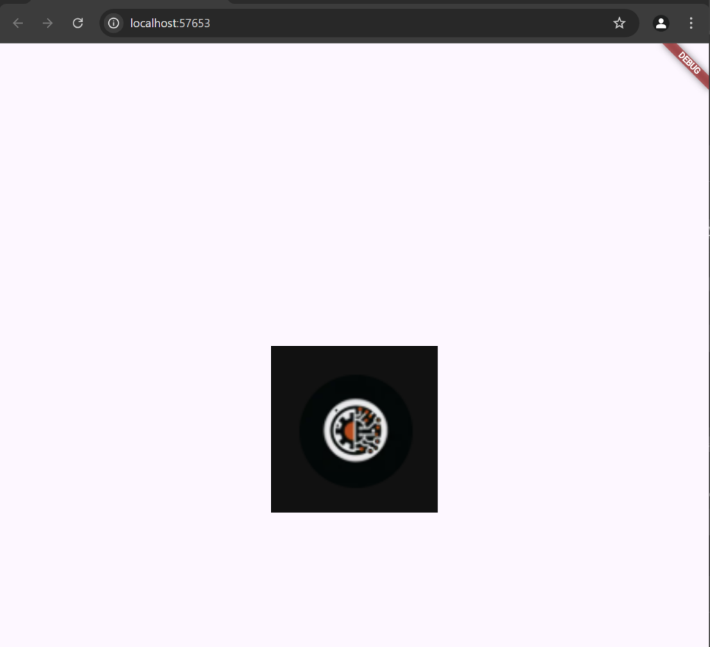
In your Dart file (e.g., main.dart), use the Image.asset widget to display the image.
import 'package:flutter/material.dart';

void main() {
  runApp(MyApp());
}

class MyApp extends StatelessWidget {
  @override
  Widget build(BuildContext context) {
    return MaterialApp(
      home: Scaffold(
        appBar: AppBar(title: Text("Local Image Example")),
        body: Center(
          child: Image.asset(
            'assets/my_image.png',  // Path to the image in assets folder
            width: 200,             // Set width as needed
            height: 200,            // Set height as needed
            fit: BoxFit.cover,      // Scale the image to cover the area
          ),
        ),
      ),
    );
  }
}
Icon
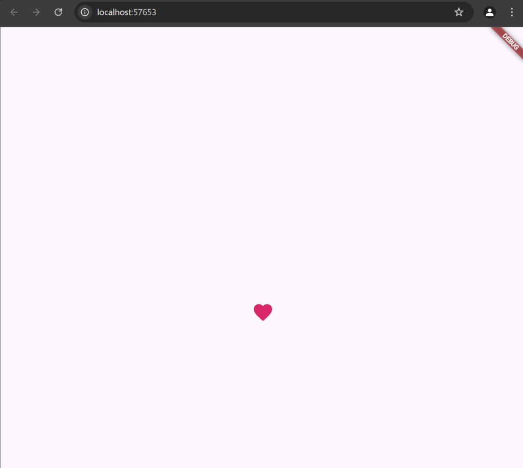
The Icon widget displays Material icons.
Icon(
  Icons.favorite,
  color: Colors.pink,
  size: 36,
)
This displays a pink heart icon with a size of 36. You can explore different icons by browsing Flutter’s icon library.
Column
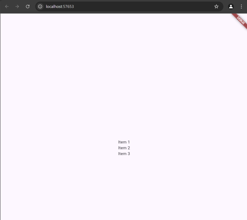
The Column widget arranges children vertically.
Column(
  mainAxisAlignment: MainAxisAlignment.center,
  children: [
    Text("Item 1"),
    Text("Item 2"),
    Text("Item 3"),
  ],
)
This creates a vertically centered list of text items. The mainAxisAlignment property defines how the children are aligned vertically.
Row
The Row widget arranges children horizontally.
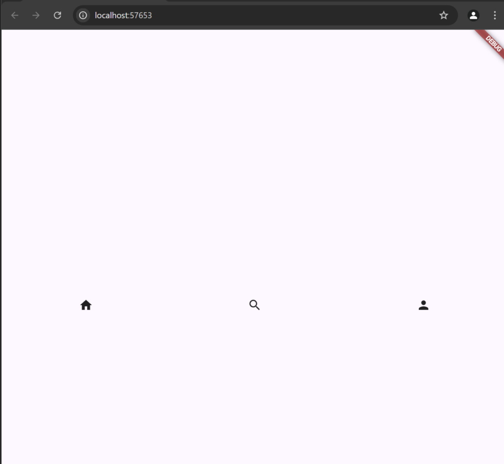
Row(
  mainAxisAlignment: MainAxisAlignment.spaceAround,
  children: [
    Icon(Icons.home),
    Icon(Icons.search),
    Icon(Icons.person),
  ],
)
This creates a row of icons spaced evenly. The mainAxisAlignment property controls horizontal alignment.
Padding
The Padding widget adds padding around its child.
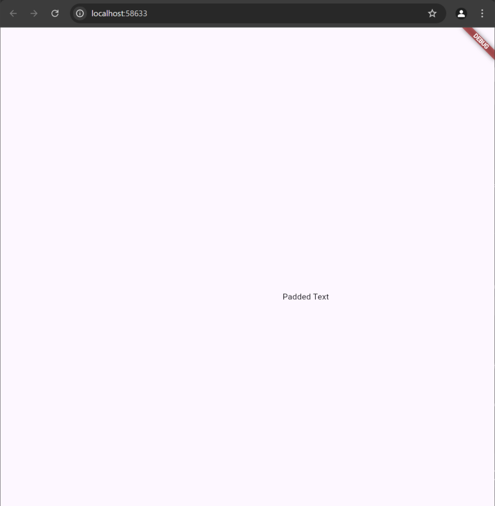
Padding( padding: EdgeInsets.only(left:200),
                  child: Text("Padded Text"),
                )
This adds 200 pixels of padding only the left side of the text. You can specify all sides padding for each side using EdgeInsets.all.
Align
The Align widget positions its child within itself based on the specified alignment.
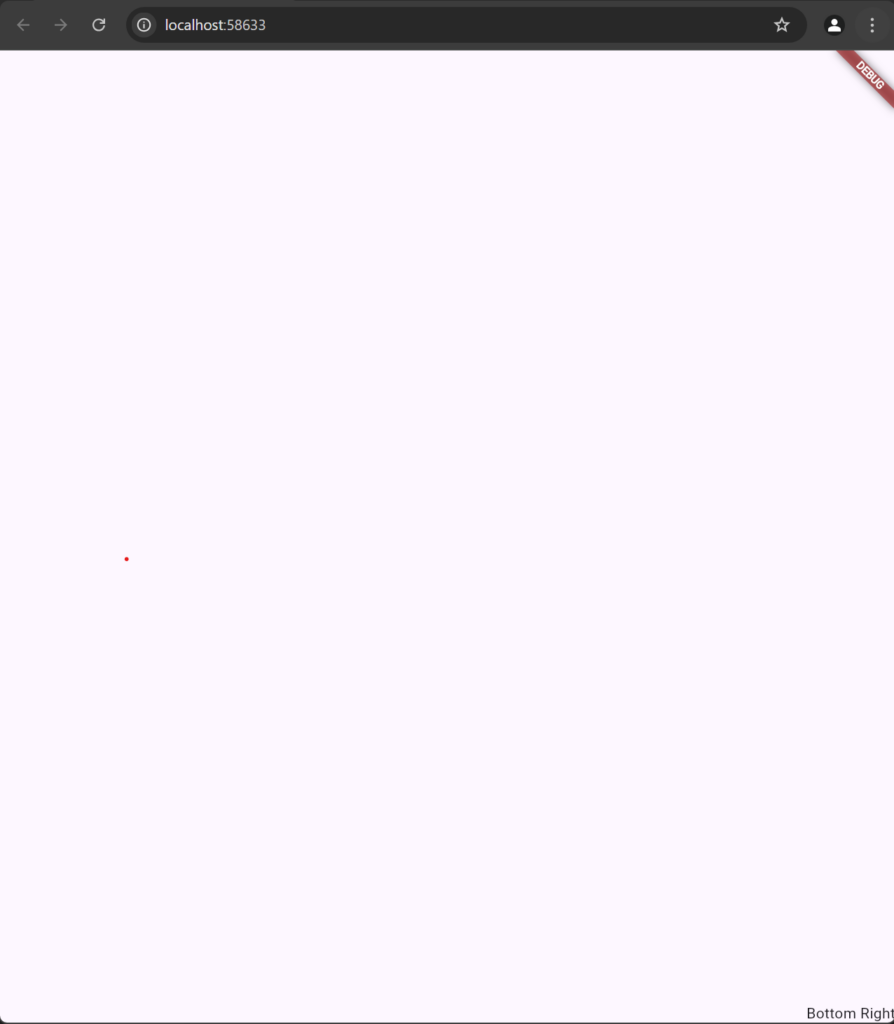
Align(
  alignment: Alignment.bottomRight,
  child: Text("Bottom Right"),
)
This aligns the text to the bottom-right corner of the Align widget. Align is useful for precise positioning within a container.
Expanded
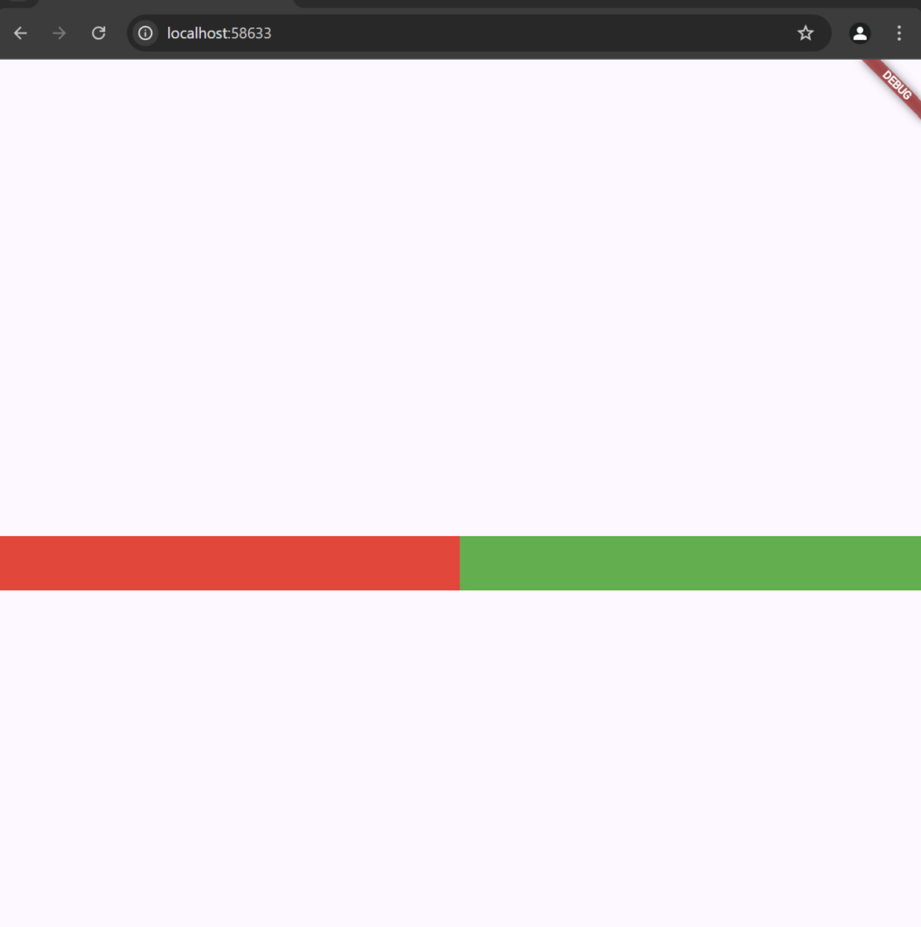
The Expanded widget expands its child to fill available space within a Row, Column, or Flex.
Row(
  children: [
    Expanded(
      child: Container(color: Colors.red, height: 50),
    ),
    Expanded(
      child: Container(color: Colors.green, height: 50),
    ),
  ],
)
This creates two equally sized boxes (red and green) that each take up half of the row’s width. Expanded is ideal for responsive layouts
SizedBox
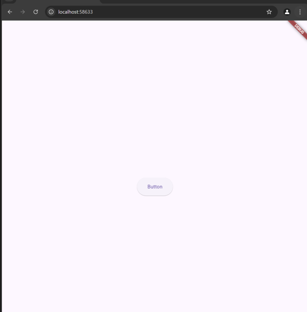
The SizedBox widget creates a fixed-size box or space between widgets.
SizedBox(
  width: 100,
  height: 50,
  child: ElevatedButton(
    onPressed: () {},
    child: Text("Button"),
  ),
)
This creates a button with fixed dimensions (100×50).
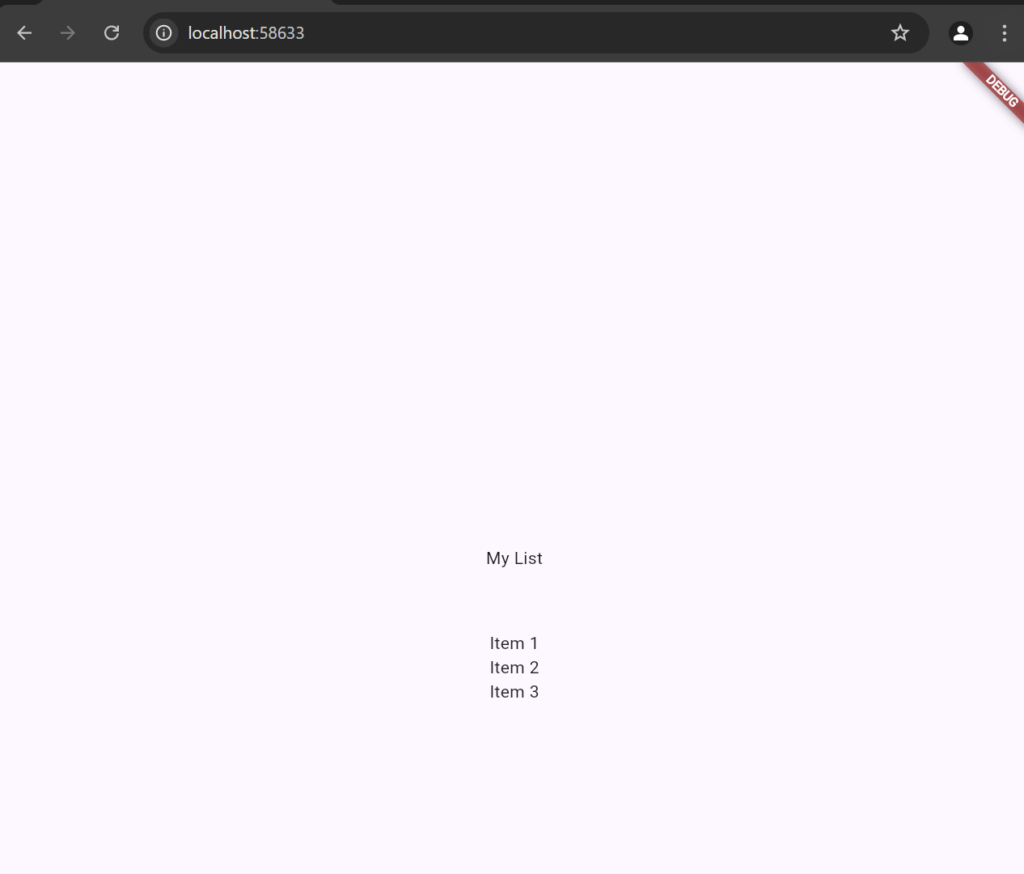
SizedBox can also be used as a spacer by specifying only width or height.
Column(
        mainAxisAlignment: MainAxisAlignment.center,
        children: [
          Text("My List"),
          SizedBox(height: 50,),
          Text("Item 1"),
          Text("Item 2"),
          Text("Item 3"),
        ],
      )
Putting it all together
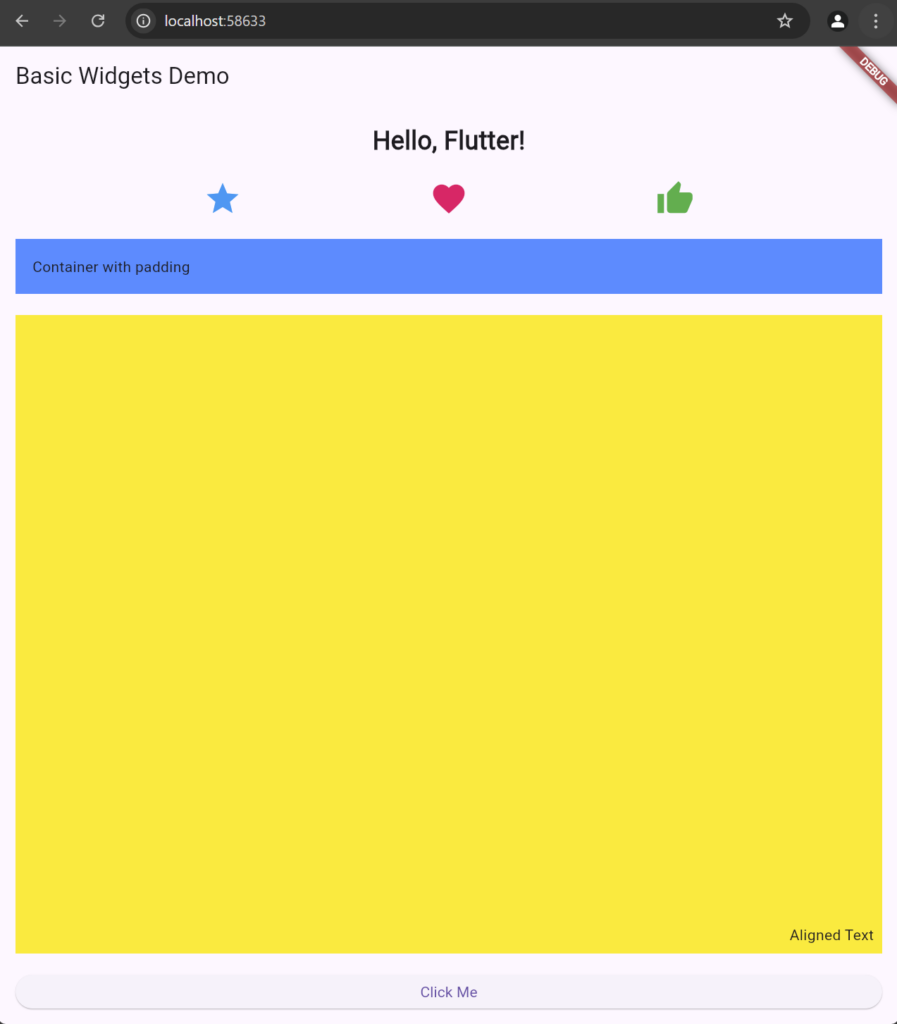
Here’s an example that combines several basic widgets into a single layout:
import 'package:flutter/material.dart';

void main() {
  runApp(MyApp());
}

class MyApp extends StatelessWidget {
  @override
  Widget build(BuildContext context) {
    return MaterialApp(
      home: Scaffold(
        appBar: AppBar(title: Text("Basic Widgets Demo")),
        body: Padding(
          padding: const EdgeInsets.all(16.0),
          child: Column(
            crossAxisAlignment: CrossAxisAlignment.stretch,
            children: [
              Center(
                child: Text(
                  "Hello, Flutter!",
                  style: TextStyle(fontSize: 24, fontWeight: FontWeight.bold),
                ),
              ),
              SizedBox(height: 20),
              Row(
                mainAxisAlignment: MainAxisAlignment.spaceEvenly,
                children: [
                  Icon(Icons.star, color: Colors.blue, size: 36),
                  Icon(Icons.favorite, color: Colors.pink, size: 36),
                  Icon(Icons.thumb_up, color: Colors.green, size: 36),
                ],
              ),
              SizedBox(height: 20),
              Container(
                padding: EdgeInsets.all(16),
                color: Colors.blueAccent,
                child: Text("Container with padding"),
              ),
              SizedBox(height: 20),
              Expanded(
                child: Container(
                  color: Colors.yellow,
                  child: Align(
                    alignment: Alignment.bottomRight,
                    child: Padding(
                      padding: EdgeInsets.all(8),
                      child: Text("Aligned Text"),
                    ),
                  ),
                ),
              ),
              SizedBox(height: 20),
              ElevatedButton(
                onPressed: () {},
                child: Text("Click Me"),
              ),
            ],
          ),
        ),
      ),
    );
  }
}
This app demonstrates each of the basic widgets within a structured layout. Here’s a summary of the widget roles in this example:
- Center: Centers the “Hello, Flutter!” text.
- Row: Arranges the icons horizontally with even spacing.
- Container: Adds padding and background color to its child.
- Expanded: Expands a yellow container to take up available space in the column.
- Align: Positions text within the bottom-right corner of the yellow container.
- SizedBox: Adds space between widgets.
- Padding: Adds overall padding around the column.
By experimenting with these basic widgets, you’ll get comfortable building and arranging UI elements in Flutter. Each widget is fundamental to constructing more complex layouts in your applications.
