Basic file setup
Create a new Flutter project or open an existing one. We will add examples of each button in the main.dart file.
import 'package:flutter/material.dart';

void main() {
  runApp(const MainApp());
}

class MainApp extends StatelessWidget {
  const MainApp({super.key});

  @override
  Widget build(BuildContext context) {
    return MaterialApp(
      home: Scaffold(
        body:  Center(
          child: //add code here
        )
        ),
      );
  }
}
ElevatedButton
An ElevatedButton is a material button that has elevation, which gives it a shadow effect. It’s commonly used for primary actions.
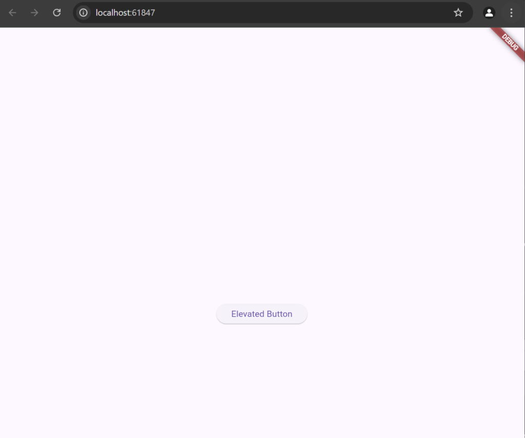
ElevatedButton(
  onPressed: () {
    print("ElevatedButton Pressed");
  },
  child: Text("Elevated Button"),
)
Add Styling to ElevatedButton
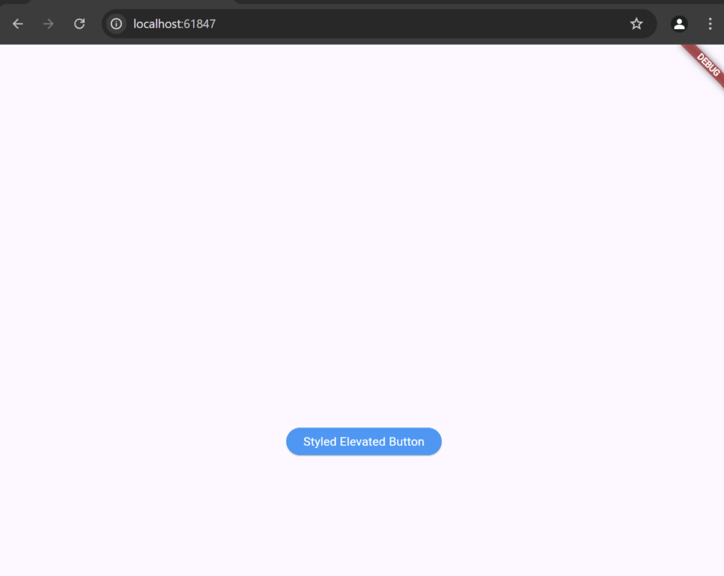
ElevatedButton(
                style: ElevatedButton.styleFrom(
                  backgroundColor: Colors.blue, // Replaces `primary`
                  foregroundColor: Colors.white, // Replaces `onPrimary`
                  padding: EdgeInsets.symmetric(horizontal: 20, vertical: 10),
                ),
                onPressed: () {},
                child: Text("Styled Elevated Button"),
              )
This button is used for primary actions.
TextButton
A TextButton is a button with only text, with no shadow or background color.
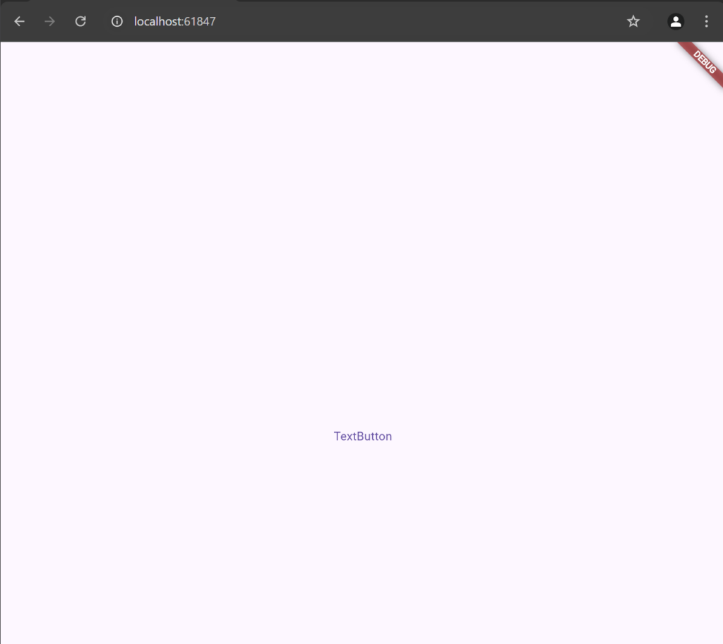
TextButton(
onPressed: () {
print(“TextButton pressed”);
},
child: Text(“TextButton”),
)
This button is typically used for secondary actions.
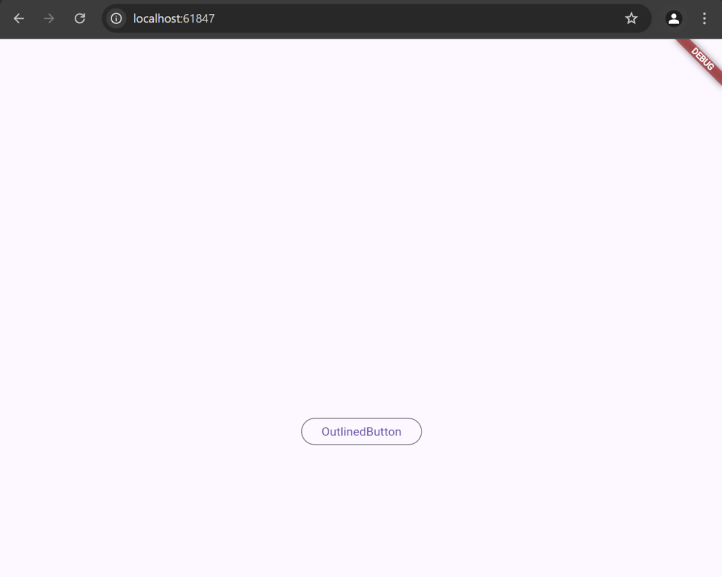
OutlinedButton
An OutlinedButton has a border around it but no filled background color.
OutlinedButton(
      onPressed: () {
        print("OutlinedButton pressed");
      },
      child: Text("OutlinedButton"),
    )
This button is ideal for actions that are not the primary focus.
IconButton
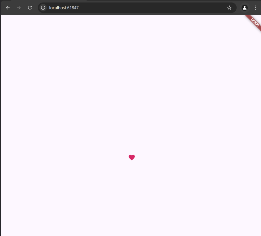
An IconButton is a button with just an icon and is commonly used for icon-only actions like “delete” or “favorite.”
IconButton(
                icon: Icon(Icons.favorite, color: Colors.pink),
                onPressed: () {
                  print("IconButton pressed");
                },
              )
This example creates a heart icon button that prints a message when pressed.
FloatingActionButton
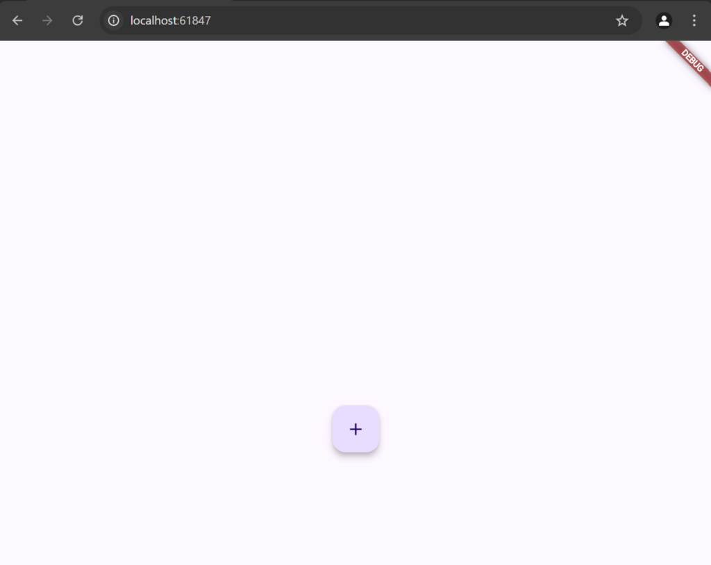
A FloatingActionButton (FAB) is a round button often used for primary actions on a screen, typically in a Scaffold.
FloatingActionButton(
                  onPressed: () {
                    print("FloatingActionButton pressed");
                  },
                  child: Icon(Icons.add),
                ),
This adds a round FAB with a “+” icon to the screen, commonly used for actions like “add.”
DropdownButton
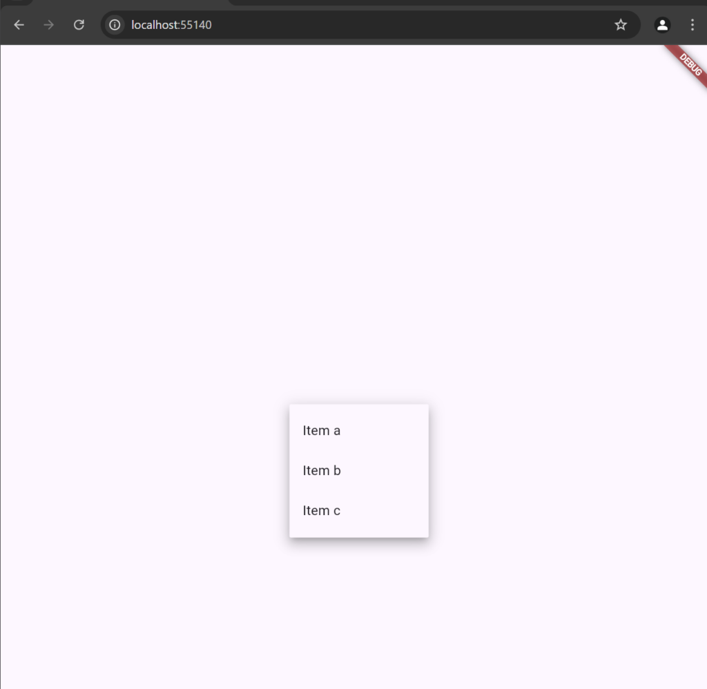
A DropdownButton provides a dropdown menu for selecting items from a list.
- Create a DropdownButtonWidget File
import ‘package:flutter/material.dart’;
class DropdownButtonWidget extends StatefulWidget {
@override
_DropdownButtonWidgetState createState() => _DropdownButtonWidgetState();
}
class _DropdownButtonWidgetState extends State<DropdownButtonWidget> {
String? _selectedItem;
@override
Widget build(BuildContext context) {
return DropdownButton<String>(
hint: Text(“Select an item”),
value: _selectedItem,
items: [“Item a”, “Item b”, “Item c”].map((String item) {
return DropdownMenuItem<String>(
value: item,
child: Text(item),
);
}).toList(),
onChanged: (newValue) {
setState(() {
_selectedItem = newValue;
});
},
);
}
}
2) Add this to the main.dart file
import 'package:flutter/material.dart';
import 'package:basic_widgets/dropdownButtonWidget.dart';
void main() {
  runApp(const MainApp());
}

class MainApp extends StatelessWidget {
  const MainApp({super.key});

  @override
  Widget build(BuildContext context) {
    return MaterialApp(
      home: Scaffold(
        body:  Center(
          child: DropdownButtonWidget()
        )
        ),
      );
  }
}
PopupMenuButton
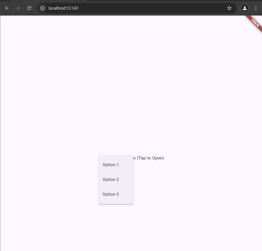
A PopupMenuButton displays a menu when pressed, usually for additional options.
- Create a PopupMenuButtonWidget.dart file
import 'package:flutter/material.dart';

class PopupMenuButtonWidget extends StatelessWidget {
  @override
  Widget build(BuildContext context) {
    return PopupMenuButton<String>(
      onSelected: (String value) {
        print("Selected: $value");
      },
      itemBuilder: (BuildContext context) => [
        PopupMenuItem<String>(
          value: "Option 1",
          child: Text("Option 1"),
        ),
        PopupMenuItem<String>(
          value: "Option 2",
          child: Text("Option 2"),
        ),
        PopupMenuItem<String>(
          value: "Option 3",
          child: Text("Option 3"),
        ),
      ],
      child: Text("PopupMenuButton (Tap to Open)"),
    );
  }
}
2) Add this to the main.dart file
import ‘package:basic_widgets/PopupMenuButtonWidget.dart’;
import ‘package:flutter/material.dart’;
import ‘package:basic_widgets/PopupMenuButtonWidget.dart’;
void main() {
runApp(const MainApp());
}
class MainApp extends StatelessWidget {
const MainApp({super.key});
@override
Widget build(BuildContext context) {
return MaterialApp(
home: Scaffold(
body: Center(
child: PopupMenuButtonWidget()
)
),
);
}
}